Google Brings Water Data to Life
New Collaboration Tool Allows for Seamless Integration of Water Data from Around the World

by Aubrey Ann Parker
Circle of Blue
With all the power of 21st century collaboration technology, nothing to date has tamed the massive amounts of disparate water information locked away in diverse database systems. But that may have changed last week when Google Labs launched Fusion Tables, a powerful new online research and data organizing tool that makes it much easier to share and navigate the world’s digital science and technical archives.
Fusion Tables, which was developed by Google engineers using sample research data about the global fresh water crisis provided by the Pacific Institute and Circle of Blue, is specifically designed to unlock a treasure trove of facts, trends, and scientific findings that until now have been sequestered in databases and spreadsheets not easily shared.
The new Google technology provides users a rare opportunity to share critical data, probe them, organize pertinent information and generate design elements — charts and graphs — that translate complex information into much more digestible trends. The intent is to enable online collaborators to study and understand in new dimensions the world’s complex problems — the fresh water crisis among them — discern the salient details and organize those scientifically confirmed facts. They can be used to tell stories, offer insights, and propose solutions that heretofore were largely the purview of scholars and scientific experts.
“The biggest potential is to build an ecosystem of data on the Web,” said Alon Halevy, the senior Google engineer who led the Fusion Tables development team. “This means making it easy for the people to upload, to merge data sets, to discuss the data, to create visualizations and then to take these visualizations and put them elsewhere on the Web so that there’s better data on the Web.”
Unlike Google Spreadsheets, which supports smaller data files, Fusion Tables enables users to upload and manage huge databases of information by filtering, aggregating and merging relevant data sets, such as spreadsheets and common CSV files. Previously, sharing data of this magnitude was almost impossible due to differences in file formats and the need for direct communication between collaborators.
Video by Aaron Jaffe/Circle of Blue
Fusion Tables, a breakthrough application of online research and communications capacities, goes beyond traditional database systems because it allows users to share and merge data in real time with other contributors wherever they work. It also allows users to apply visualizations, and discuss discrepancies of specific data points. Multiple users can cross-check and discuss individual rows, columns or even cells as easily as right-clicking on the spot.
Users can also display their data through a variety of visualizations: as a timeline, a graph or a map. The “fusion” of the data sets can link dissimilar information from the far corners of the Web to reveal patterns and trends that might be impossible to spot otherwise. This makes Fusion Tables a central hub for data collaboration, as anyone can publish and access files, which were formerly locked away in Excel spreadsheets, PDF reports, and hard-cover textbooks.
“The challenge of sharing data about water was one of our initial inspirations,” Halevy said.
Circle of Blue and the Pacific Institute participated with Google in the design and development of Fusion Tables. The result is a powerful research and story-telling tool, equally accessible to journalists and scientists.
Video by Aaron Jaffe/Circle of Blue
“There is an enormous amount of water data out there, but data by itself doesn’t tell the story; data are only numbers,” said Peter Gleick, president of the Pacific Institute. “If we can find innovative ways to convert data into action, then data is important.”
For instance, journalists from Circle of Blue wanted to understand the influence of per capita income and the availability of tap water on the incidence of child mortality worldwide from diarrhea. Circle of Blue merged Pacific Institute data in the Fusion Table Gallery with data sets from the Internet.
Fusion Tables created a scatter plot that revealed a noticeable and predictable correlation of death by water-related illness, wealth and safe drinking water availability. As the gross domestic product per capita increased, the percentage of a country’s population connected to tap water increased, and child deaths related to diarrhea decreased.
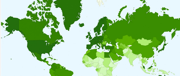
While intuitive, the correlation is striking and more obvious when tap water availability and diarrhea deaths are compared on an intensity map that Fusion Tables also makes easy and practical. Dark green on the above map indicates the countries with high access to tap water. On the map below, the intense green shows the regions with the highest percentage of diarrhea-caused child deaths. The two maps are virtually inverse images of one another, clearly illustrating that death by a water-related disease is relative to access to safe drinking water.
“Fusion Tables gives the world’s news organizations and the public a much more powerful and accessible online library of technical information and detail,” said J. Carl Ganter, director and co-founder of Circle of Blue. “As the community of Fusion Tables users grows, the trends and stories this tool reveals will help us understand more clearly and respond more efficiently and quickly to global challenges, such as the fresh water crisis.”
“As Circle of Blue does with front-line reporting of water issues, we hope to provide new ways of looking at problems, collecting vast amounts of information and making it widely relevant, visual and accessible,” Halevy said.
Join the Data Revolution
Circle of Blue wants your water data. Send your Excel and CSV files to data@circleofblue.org, and we will look for trends and comparisons. Walk through the tutorial with Circle of Blue’s Aubrey Ann Parker who will show you how to upload data sets and make your own comparisons.
Aubrey Ann Parker, an undergraduate student at the University of Michigan, is an intern at Circle of Blue where she specializes in data visualization. Reach her at circleofblue.org/contact.
All video by Aaron Jaffe for Circle of Blue. Nadya Ivanova, Cody T. Pope and Keith Schneider contributed to this article.
is a Traverse City-based assistant editor for Circle of Blue. She specializes in data visualization.
Interests: Latin America, Social Media, Science, Health, Indigenous Peoples





I hope the information I just sent to your “data” email address will be of interest and of help to add to your data base.
Terry
No way! Interesting information in this article! I’m wicked proud of you Aubrey!
Impressive article, Aubrey!
Fascinating article. However, I was hoping to play around with the fuson tables and for some reason the google gadgets don’t seem to load up. Can you get one of your technies to take a look? Keep up the great work.
Brian Mc Fadden
http://www.watersanitationhygiene.org
Fascinating article. However, I was hoping to play around with the fusion tables but unfortunately the google gadgets don’t load in internet explorer or firefox. Can you get one of your techies to take a look? Keep up the great work.
Brian McFadden
http://www.watersanitationhygiene.org
Interesting and useful information, Hindi Indiawaterportal is a water knowledge portal in Hindi, the information of Water Data to life can be read here in hindi
http://hindi.indiawaterportal.org/content/????-????-??-?????
I think it`s very good to add same GIS map to explore the data under thematic maps not only as a table.
Great information, thanks for sharing! I’ve promoted your article on my Twitter feed.
great article and insights.
Informative article, thanx for share, i’m learning Fusion tables now
Thank you
very usefull information provide .. thank you
very good ARTICAL
GOOD INFOR MATIN