Harvard Students Win Urban Water Design Challenge for Interactive Water Footprint Infographic
Three weeks, 36 entries: Global competition sponsored by Circle of Blue and Visualizing.org.
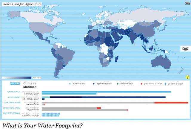
For their interactive water footprint graphic, Joseph Bergen and Nicki Huang—students at the Harvard Garduate School of Design—earned top honors in the Urban Water Design Challenge, sponsored by Circle of Blue and Visualizing.org. The winners were announced on March 22, the eighteenth annual World Water Day.
The winning graphic, “What is Your Water Footprint?”, explores water consumption based on location and lifestyle. In the first cartographic profile, users can scroll over different nations to compare details of urban population, water supply, and water usage by country. The second portion of the graphic depicts the virtual water embedded in different items, such as coffee and a computer chip.
The Urban Water Design Challenge was an ambitious and rapid-fire call to designers, data experts, visualizers, cross-disciplinary thinkers, and cutting-edge creative teams to tap into the world’s stream of water data. The goals: to display data and reveal new ways of understanding trends, patterns, complex systems, and relationships and to shine a spotlight on the urban water issue and package it in a way that makes it available to the public. The challenge was the brainchild of Circle of Blue, the leading news organization reporting global water issues, and Visualizing.org, a nonprofit platform for data visualization.
“The world water crisis is profoundly complex and interrelated,” said J. Carl Ganter, managing director of Circle of Blue. “Visualizing the water challenges helps the world understand and better respond, making connections and decisions that will affect future generations.”
The international contest offered a $5,000 cash prize, provided by General Electric. Entries from around the world drew connections between the environmental, economic, health-related, policy-driven, and climate change effects on urban water supplies, water quality, and water pricing. The judges agreed that Bergen and Huang’s treatment garnered top marks for being unique, easily accessible, and interactive.
“We had many high-quality submissions, a testament to the depth of data and the urgency of the global water crisis,” said Adam Bly, founder of Visualizing.org. “We hope this is simply the beginning of a much longer conversation about how we can use data and design to solve some of our planet’s greatest challenges.”
Competition organizers noted that mass migration from rural to urban areas is underway globally. In 2008, the world passed a historic milestone: 3.3 billion people, more than half of the planet’s population, now live in cities. Cities are simultaneously places where the most dire resource challenges converge, but they are also testing grounds for new ideas, practices, and water-related investments for managing urban transformation.
The panel of judges included:
- Adam Bly, Seed Media
- Brian Collins, Collins
- Heather Cooley, Pacific Institute
- J. Carl Ganter, Circle of Blue
- Alon Halevy, Google
- Russell Kennedy, Icograda
- Camille Kubie, General Electric
- Jennifer George-Palilonis, Ball State University
- Kimberly Ramalho, General Electric
- Arjun Thapan, Asian Development Bank
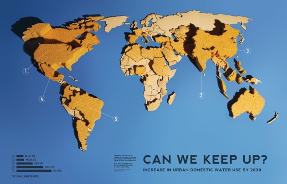
Judges awarded a runner-up prize to Matt and Hal Watts for their quirky and artistic entry, “Urban Water Needs: Can We Keep Up? (Increase in Urban Domestic Water Use by 2030).” Combining their engineering-trained precision with creativity that was honed at the London Royal College of Art, Matt and Hal first designed a world map entirely out of inexpensive kitchen sponges. They then poured water onto each country in amounts that were proportional to the expected urban water consumption in 2030. The sponges grew in height according to how thirsty the countries will be, generating a stark topography of future needs for urban domestic water.
Tuduyen Nguyen and Cameron Reynolds-Flatt also earned a runner-up prize for their graphic illustration, “Water: An Unequal Human Right,” which gives an unvarnished look at the many imbalances of water around the world. The left side displays water consumption patterns in wealthy “consuming” countries—20 gallons daily down the toilet per American, 50 billion bottles consumed annually, 15,000 gallons lost to leaky plumbing—versus “developing” countries, where 90 percent of sewage and 70 percent of industrial waste is discharged without treatment and where women and children spend 40 billion hours annually walking for water. The right side of the graphic has a visual roster showing water discrepancies and is reminiscent of Harper’s Index.
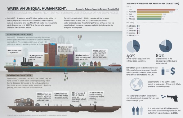
“Despite water being a universal human right, it is unequal in many ways,” Nguyen and Reynolds-Flatt submitted with their entry. “We hope, from this visualization, we can not only inform but empower people to converse about what is left of our precious water resource.”
Circle of Blue will publish more entries from the Urban Water Design Challenge over the coming weeks.
Did you miss your chance to participate? Designers can continue to share their visualizations throughout the year by uploading to visualizing.org.
Circle of Blue provides relevant, reliable, and actionable on-the-ground information about the world’s resource crises.





Leave a Reply
Want to join the discussion?Feel free to contribute!