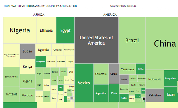
Infographic: Tree Map of Freshwater Withdrawal by Country — A Comparison Between Continents
Entry in the 2011 Urban Water Design Challenge, sponsored by Visualizing.org and Circle of Blue.
Alberto González submitted this infographic for the 2011 Urban Water Design Challenge—sponsored by Circle of Blue and Visualizing.org.

Does the population of a country impact its freshwater withdrawal? What about the effect of its geographic location? Are there differences between continents? What about within them? How is the availability of freshwater spread around the economic sectors?
This visualization contains a composition of 20 heat maps which try to answer these questions and, more importantly, establish a comparative framework between continents and variables, such as economic sectors. The lighter the color, the less water is withdrawn.
Note, however, that tree maps by continent have the same area and are not being comparable between each other, just within the continent itself: e.g. Australia does not have a higher population than the U.S., but its population is the biggest in the Oceania continent.
See the other winning designs here.
Did you miss your chance to participate? Designers can continue to share their visualizations throughout the year by uploading to visualizing.org.
Circle of Blue provides relevant, reliable, and actionable on-the-ground information about the world’s resource crises.


Leave a Reply
Want to join the discussion?Feel free to contribute!