Infographic: WASH and Urbanization — Providing Sanitation and Water Services by Country
Entry in the 2011 Urban Water Design Challenge, sponsored by Visualizing.org and Circle of Blue.
Jonathan Selsick submitted this infographic for the 2011 Urban Water Design Challenge — sponsored by Circle of Blue and Visualizing.org.
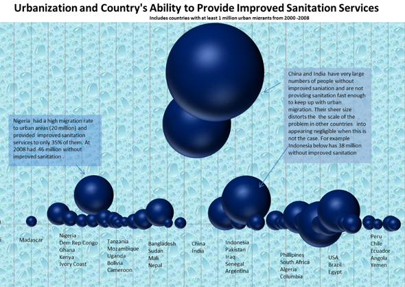
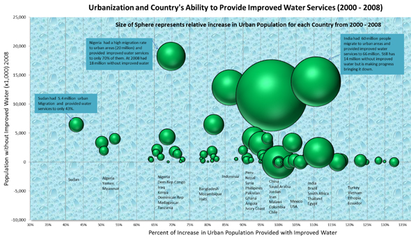
Many developing and emerging economies are experiencing huge shifts of people from rural to urban areas. The ability of countries to provide improved sanitation and water services to these new urban migrants is essential. This graphic highlights the relative scale of urbanization between countries (shown by the size of the spheres), the extent of the existing insufficiency of improved sanitation and water services (vertical axis shows number of people without improved sanitation services in the graphic with the blue spheres and the graphic with the green spheres shows the number of people without improved water services – as defined by WHO/UNICEF), and the horizaontal axis shows how well each country is keeping up in providing sanitation and water services to new urban migrants.
Below 100 percent means that people are migrating to urban areas faster than the country can provide these services. Above 100 percent means the country is keeping ahead of the trend and further improving conditions for existing urban residents who are without improved sanitation and/or water services.
See the other winning designs here.
Did you miss your chance to participate? Designers can continue to share their visualizations throughout the year by uploading to visualizing.org.
Circle of Blue provides relevant, reliable, and actionable on-the-ground information about the world’s resource crises.





though not the facts. this is the worst infographic that I have seen in a long, long time. espescially the axis selection here is the least intuitive one could think of