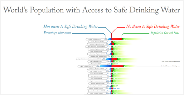
Infographic: World’s Population with Access to Safe Drinking Water
Entry in the 2011 Urban Water Design Challenge, sponsored by Visualizing.org and Circle of Blue.
Andy Jepkes submitted this infographic for the 2011 Urban Water Design Challenge—sponsored by Circle of Blue and Visualizing.org.

The relative water consumption per capita, percent usage of available freshwater in each country, and the respective breakdowns of use in agricultural, municipal, and industrial sectors are shown for the 120 fastest-urbanizing countries.
In particular, desert countries are highlighted by their enormous consumption of water—often several times greater than the extent of water in the country. Additionally, many countries where there exists a great degree of struggle over water rights are, in fact, only withdrawing a small portion of their available freshwater, indicating that lack of infrastructure is a greater crisis when compared with water unavailability.
See the other winning designs here.
Did you miss your chance to participate? Designers can continue to share their visualizations throughout the year by uploading to visualizing.org.
Circle of Blue provides relevant, reliable, and actionable on-the-ground information about the world’s resource crises.


Leave a Reply
Want to join the discussion?Feel free to contribute!