WaterViews | Infographics
Infographics by Hannah Nester for Circle of Blue. Produced as part of the WaterViews project.
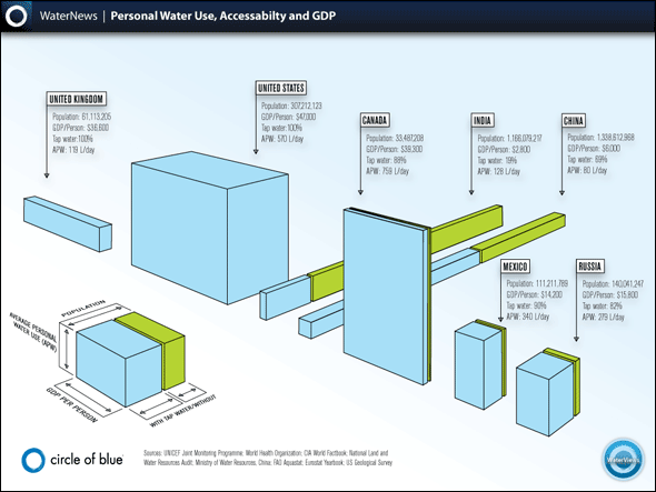
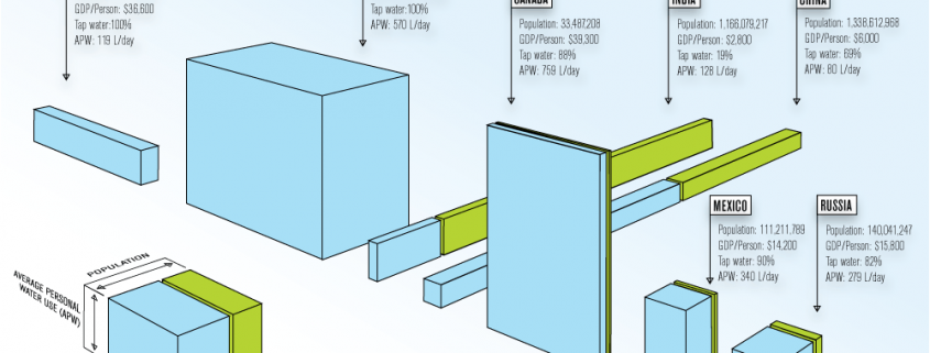
A multidimensional representation of population, GDP per capita, average personal water use (APW) and access to tap water by country. The height, width, depth of the 3-D graphics correspond to the metrics for each country. The graphics allow the comparison of data among the seven different countries. Infographic by Hannah Nester for Circle of Blue (click image to enlarge).
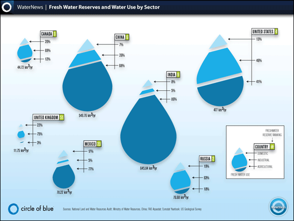
A representation of fresh water reserves, fresh water reserves ranking and water use by sector (domestic, agricultural and industrial) by country. The sizes of the droplets reflect the volume of total fresh water use per year for each of the seven countries; the sizes of the slices correspond to the percentage of water use by sector. The graphics allow the comparison of data among the different states. Infographic by Hannah Nester for Circle of Blue (click image to enlarge).
Circle of Blue provides relevant, reliable, and actionable on-the-ground information about the world’s resource crises.




Water is Life.