Designing Water Use and Pricing
Circle of Blue intern Amanda Northrop summarizes the first week of the summer she plans to spend with us.
Today marks the beginning of my second week with Circle of Blue. I just finished my sophomore year at Grand Valley State University in the graphic design program, and I’m spending my summer as an intern with Circle of Blue at the Traverse City headquarters.
Last summer’s interns, Mark Townsend and Kelly Shea, did an incredible job.
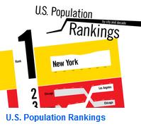
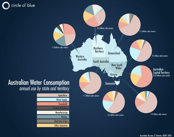
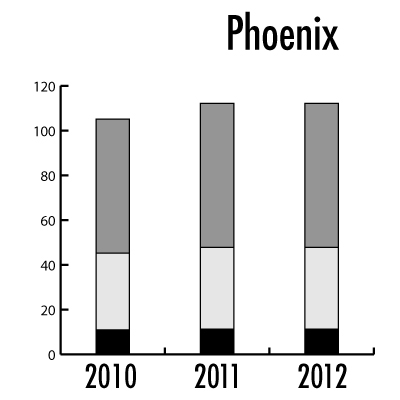
During my first week with Circle of Blue, I created an infographic that displays the water usage within each of Australia’s states and territories to accompany my colleague Nadya’s article on Australia’s agriculture and energy sectors. This week, the follow-up to our popular water pricing survey of 30 U.S. cities will publish, and I’m in charge of turning the 2012 data into a graphic — the project reminds me a bit of something I’ve done before on population changes in major U.S. cities since the 1950s.
Click on the first image above to enlarge the map I made last week of Australia’s water use per sector by state and territory. Click the second image above to enlarge a graphic I made previously of U.S. population changes since the 1950s. Click the third image to see a sneak peak of the infographic I’m working on now that will publish later this week!
Interested in design? Want to know what it’s like to intern with Circle of Blue? Email me at circleofblue.org/contact or comment below.
–Amanda Northrop
Circle of Blue design intern
Circle of Blue provides relevant, reliable, and actionable on-the-ground information about the world’s resource crises.




Leave a Reply
Want to join the discussion?Feel free to contribute!