Great Lakes Map Shows Greatest Ecosystem Stress in Lakes Erie and Ontario
Researchers hope the map is used to plan restoration projects that provide the greatest human benefits.
Brett Walton
Circle of Blue
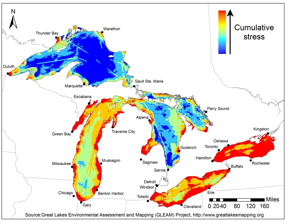
A first-of-its-kind map that pulls together numerical data on nearly three dozen factors that affect the Great Lakes ecosystem shows that the lakes with the most urban and agricultural development in their watersheds are also those with the greatest environmental stress.
Lakes Erie and Ontario, the easternmost lakes, are challenged by high coastal population densities, an industrial legacy and phosphorous pollution from agricultural runoff. They are also downstream from wind currents that drop nitrogen generated by industries and power plants into their waters.
But the map’s patches of high-stress red and yellow should not be misinterpreted. The color scale is a relative measure that compares the combined stress of the 34 environmental indicators in a particular area to the stress level of the lake system as a whole.
“Red does not mean the sky is falling,” explained Peter McIntyre, a project co-leader and an assistant professor at the University of Wisconsin who studies aquatic biodiversity. It means that conditions are worse there than other areas.
The study comes at an auspicious time for the watershed that holds one of every five gallons of fresh water on the planet’s surface. For the last decade, water levels in three lakes — Huron, Michigan and Superior — have been lower than average, which exacerbates other problems with invasive species, port operations and water temperatures, says Nick Schroeck, executive director of the Great Lakes Environmental Law Center who was not part of the study.
Water levels on the Lake Michigan-Huron system are currently tied for the lowest levels ever recorded in December, matching measurements taken in 1964.
Drawing Lines in the Water
To create the maps, the research team queried some 160 experts from universities, nonprofits and government agencies in the United States and Canada and compiled a list of 50 key biological, chemical or physical indicators, of which two-thirds had data sufficient enough to be plotted.
Because not all stressors are equally deleterious, researchers gave each a weight along with its own map. The highest ranking — and thus most detrimental — sources of stress were invasive aquatic species such as mussels and lamprey, changes to summer temperatures and winter ice cover because of a warming climate, phosphorous concentrations, and coastal development. Light pollution ranked as the least intrusive.
The resultant set of 34 individual stressor maps and a single cumulative stress map, which sums the individual components, are tools policymakers and planners can use to set priorities for watershed restoration that provides the greatest benefits to people, said David Allan, the project leader and a professor of aquatic sciences at the University of Michigan’s School of Natural Resources and Environment.
There is certainly money sloshing around for such projects. Over the last three years the Obama administration has guided $US 1 billion to its Great Lakes Restoration Initiative.
Allan, speculating about ways in which the maps might be used, told Circle of Blue the places with the biggest problems are not necessarily the places with the greatest need for restoration.
“I wonder if we don’t pay too much attention to places that are the worst,” he said. “What are people getting out of it? What is the return on investment? It might be better to focus on places with fewer problems but higher human use.”
The researchers made the human connection easier to see by adding map layers that represent recreational and commercial benefits — marinas, bird-watching sites, fish spawning grounds, and frequently visited beaches. The recreational and commercial fishing industry brings in billions of dollars each year to the eight Great Lakes states.
Now that the map’s first iteration is public, Allan and the research team are looking for data to fill out the remaining 16 indicators. Their highest priority, Allan said, is data on algal blooms.
The map was published December 17 in an article online in the Proceedings of the National Academy of Sciences. Funding for the three-year project was provided by the Michigan-based Fred A. and Barbara M. Erb Family Foundation.
Brett writes about agriculture, energy, infrastructure, and the politics and economics of water in the United States. He also writes the Federal Water Tap, Circle of Blue’s weekly digest of U.S. government water news. He is the winner of two Society of Environmental Journalists reporting awards, one of the top honors in American environmental journalism: first place for explanatory reporting for a series on septic system pollution in the United States(2016) and third place for beat reporting in a small market (2014). He received the Sierra Club’s Distinguished Service Award in 2018. Brett lives in Seattle, where he hikes the mountains and bakes pies. Contact Brett Walton






Trackbacks & Pingbacks
[…] is an image of the stress of pollution of the Great Lakes. Lake Superior, with the lowest amount of human interaction, is still relatively […]
Leave a Reply
Want to join the discussion?Feel free to contribute!