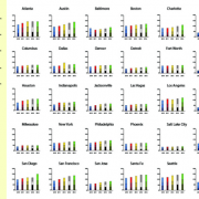
Map: 2012 Water Prices in 30 Major U.S. Cities

Map: 2012 Water Prices in 30 Major U.S. Cities

The price that Americans pay for water is rising faster than the cost of any other utility service in the United States — be it gas, electricity, or telephone charges.

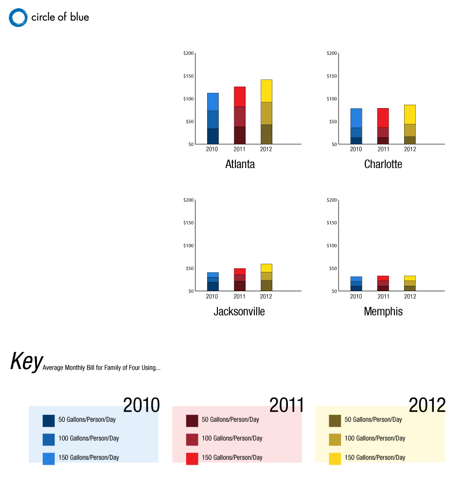
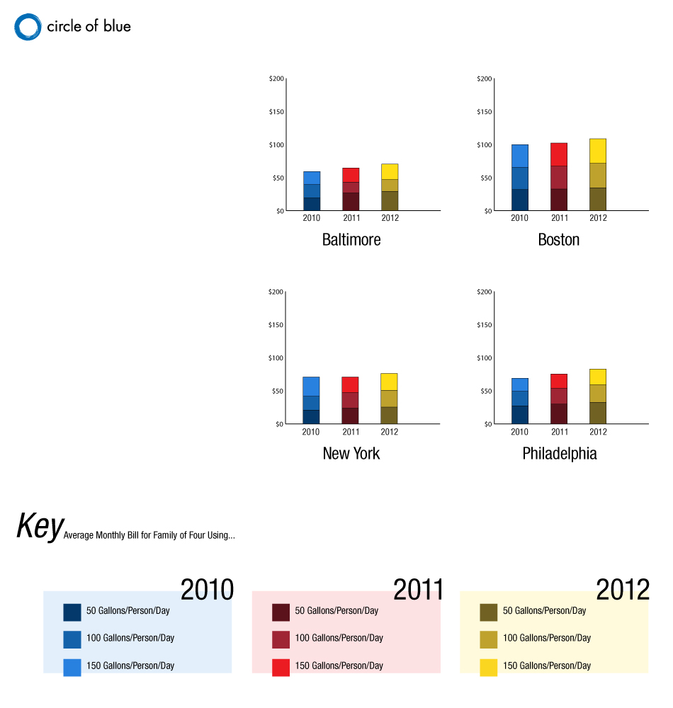
According to the newest report in an ongoing national survey conducted by Circle of Blue, water prices in 30 major U.S. cities rose 18 percent over the last two years and 7 percent in the past year.
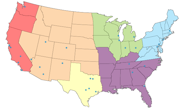
map interactive water price pricing use san francisco chicago baltimore boston new york city philadelphia philly columbus detroit indianapolis milwaukee atlanta charlotte jacksonville memphis austin dallas fort worth houston san antonio denver las vegas phoenix tucson santa fe salt lake city fresno los angeles san diego san jose seattle

water price pricing use chicago columbus detroit indianapolis milwaukee water price pricing use denver las vegas phoenix tucson santa fe salt lake city water price pricing use san francisco los angeles san diego san jose seattle water price pricing use austin dallas fort worth houston san antonio texas East Coast water price pricing use baltimore boston new york city philadelphia philly Southeast water prices pricing atlanta memphis
Map © Kalin Wood / Circle of Blue. Graphs © Amanda Northrop / Circle of Blue
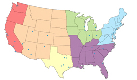
Interactive Map: A comparison of water prices from 2010 to 2012 in 30 major U.S. cities. Click each region above for graphical comparisons below.

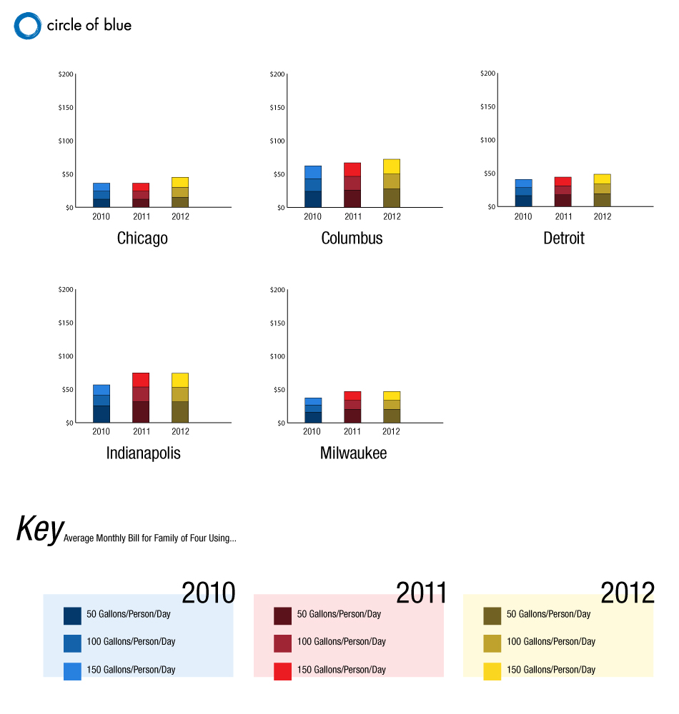
Midwest Map

Graphic © Amanda Northrop / Circle of Blue
A comparison of water prices from 2010 to 2012 in the Midwestern U.S. Click image to enlarge.

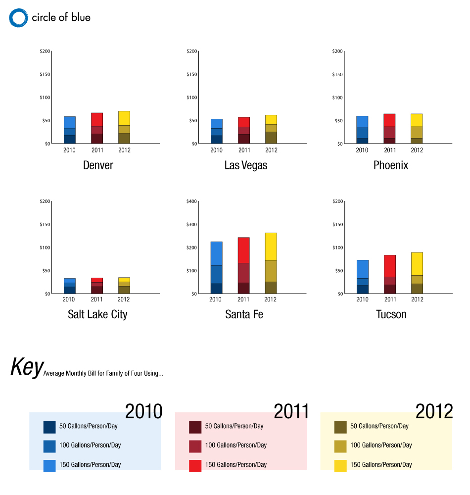
Mountain Map

Graphic © Amanda Northrop / Circle of Blue
A comparison of water prices from 2010 to 2012 in the Rocky Mountain U.S. Click image to enlarge.

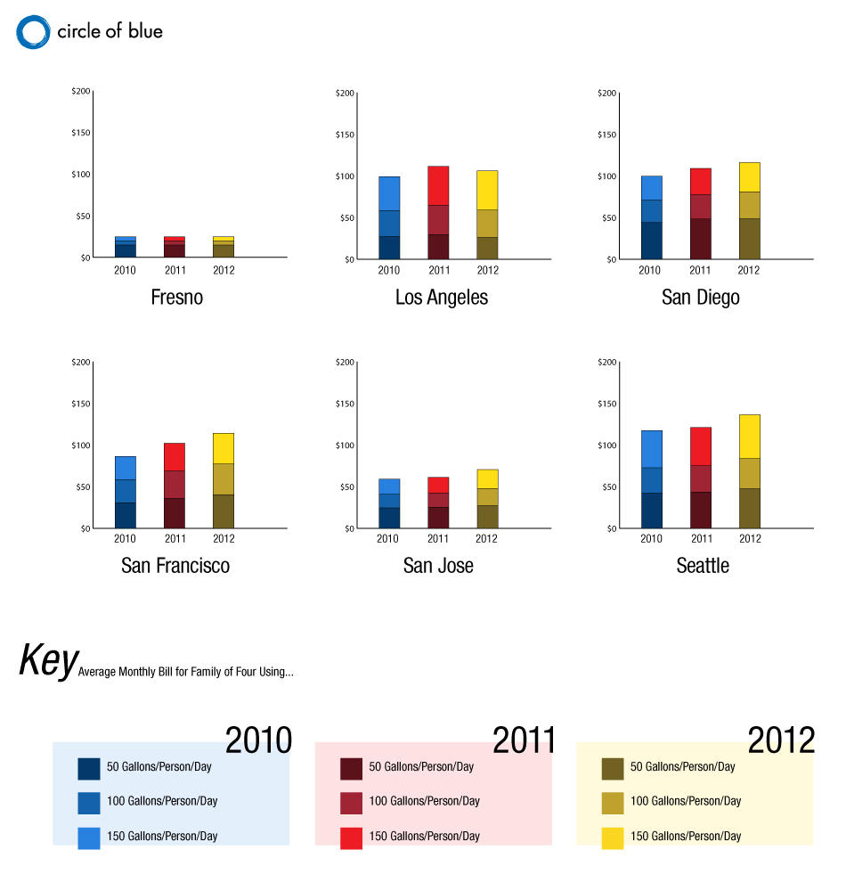
West Coast Map

Graphic © Amanda Northrop / Circle of Blue
A comparison of water prices from 2010 to 2012 on the West Coast of the U.S. Click image to enlarge.

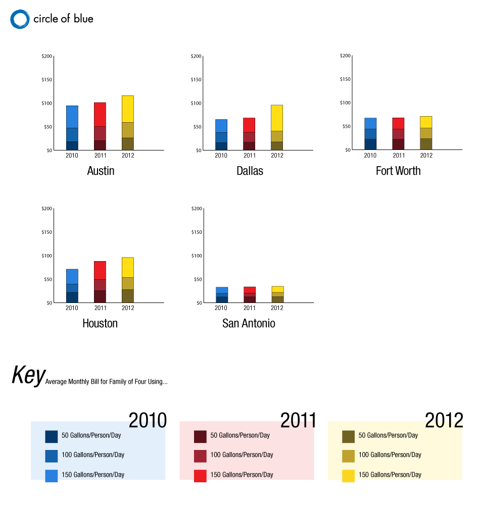
Texas Map

Graphic © Amanda Northrop / Circle of Blue
A comparison of water prices from 2010 to 2012 in Texas. Click image to enlarge.

Southeast Map

Graphic © Amanda Northrop / Circle of Blue
A comparison of water prices from 2010 to 2012 in the Southeastern U.S. Click image to enlarge.

East Coast Map

Graphic © Amanda Northrop / Circle of Blue
A comparison of water prices from 2010 to 2012 on the East Coast of the U.S. Click image to enlarge.

Amanda Northrop is an undergraduate student at Grand Valley State University and a Traverse City-based design intern for Circle of Blue. Kalin Wood was a design intern for Circle of Blue during the summer of 2010, when the water pricing story was first released.

This infographic was made to accompany an article written by Circle of Blue reporter Brett Walton: The Price of Water 2012: 18 Percent Rise Since 2010, 7 Percent Over Last Year in 30 Major U.S. Cities. Reach Northrop at circleofblue.org/contact.

7 replies

Leave a Reply

Want to join the discussion?
Feel free to contribute!

Leave a Reply