Infographic: California Drought In Motion — 10 Dry Years Animated GIF (2003-2014)
When layered, weekly images of the U.S. Drought Monitor for California show how much worse this drought is than any in the past decade.
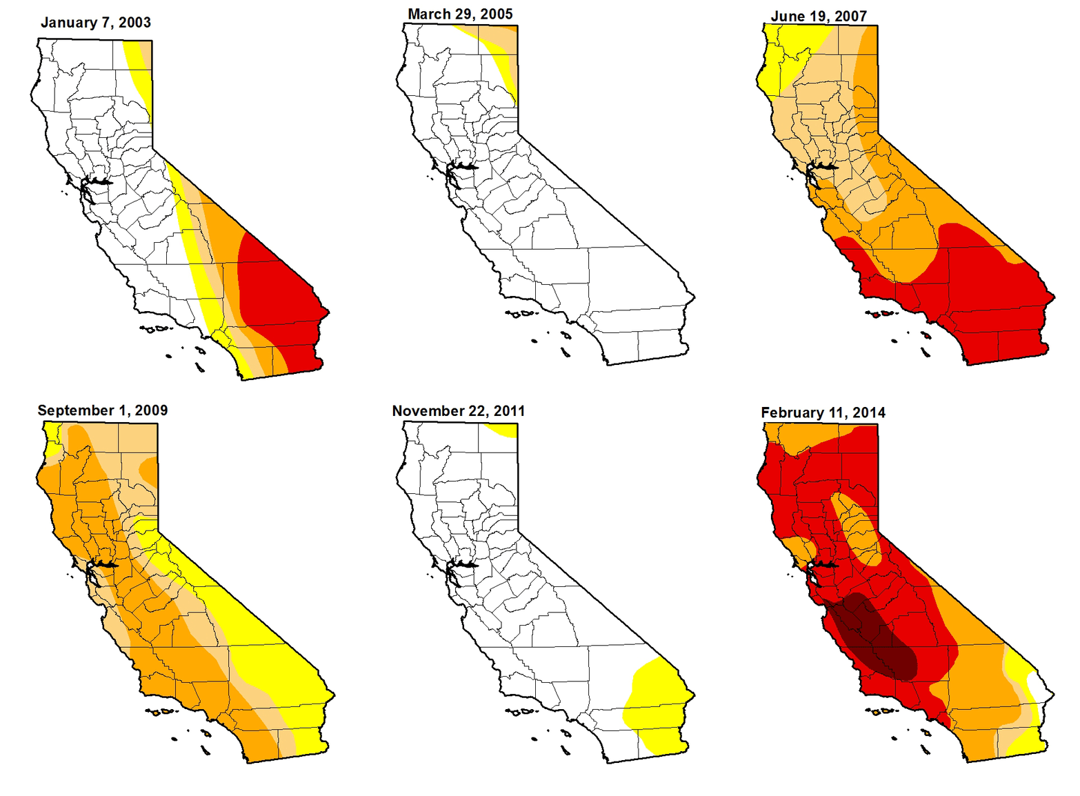
This GIF map was created by Aubrey Ann Parker, news editor and data analyst for Circle of Blue. Contributors include Brett Walton and Codi Yeager-Kozacke of Circle of Blue, with images pulled from the U.S. Drought Monitor.
is a Traverse City-based assistant editor for Circle of Blue. She specializes in data visualization.
Interests: Latin America, Social Media, Science, Health, Indigenous Peoples
Leave a Reply
Want to join the discussion?Feel free to contribute!

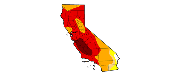



This map is truly amazing. I didn’t realize until now just how about California’s drought is until I saw the current day map in comparison to previous years, especially 2005, 2006 and 2010 when the drought was nowhere near as severe.
The only good news is that this isn’t the first extremely severe drought California has gone through and it certainly won’t be the last. Back in the early 1990s, I had a sister living in Palo Alto and I remember her telling me that the scuttlebutt among Californians was that what they had wasn’t a drought but rather a permanent condition which they would have to accept. Low and behold, a few years went by and the El Niño effect took place and in about six months, the severe drought was over.