Infographic: The Drier, Wetter, Warming U.S.
Despite warm and cold extremes in 2014, precipitation and temperature trends over the past century show a drier Southwest and Southeast, a wetter Midwest and Northeast, and overall warming.
By Kaye LaFond
Circle of Blue
The data is in, and though 2014 was a year of weather extremes, more than 120 years of record-keeping show a steady climatic progression. Over the last 50 years, changes in precipitation and temperature have amplified. Some regions of the country are drying out or becoming wetter. The entire United States has warmed.
The annual State of the Climate report was released earlier this month by the National Oceanic and Atmospheric Administration’s National Climatic Data Center (NCDC). The report includes temperature and precipitation data for the year 2014. Noteworthy climate events in 2014 include:
- The northern swath of the country was wetter than usual in 2014.
- Only Oklahoma, Texas, and West Virginia experienced a drier than average year in 2014.
- Arizona, California, and Nevada recorded their warmest year ever in 2014. Most other Western states were warmer than average.
- The central corridor of the United States – especially Wisconsin, Iowa, Missouri, Arkansas and Louisiana –were much colder than normal.
- The world as a whole experienced its warmest year on record in 2014.
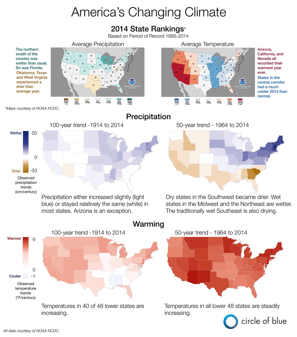
Two maps at the top of the graphic below show state rankings of 2014 precipitation and temperature as compared to the entire 120-year record from 1895 to 2014. The high numbers correspond to wet or warm years. The low numbers correspond to dry or cold years.
For example, the red ‘120’ on California in the temperature map means that the state experienced its warmest year ever recorded, while the blue ‘10’ on Michigan means that 2014 was that state’s 10th coldest year.
Despite numerous highs and lows in both precipitation and temperature during 2014, the trends that researchers have been seeing for decades stand largely unaltered. Using data from the NCDC report, Circle of Blue created the trend maps in the bottom half of the graphic. Trends in precipitation and temperature for each state are shown over the past 50 and 100 years.
is both a scientist and a journalist, she holds an MS in Environmental Engineering from Michigan Technological University, and she brings proficiency in ESRI’s ArcGIS mapping software.





Leave a Reply
Want to join the discussion?Feel free to contribute!