Posts

Map: California’s Water Use Per County (1985-2005)
0 Comments
/
Click through the interactive Google Fusion Tables infographic to see how California’s water use has changed over the last two decades and how these trends relate to population demographics and water contamination.

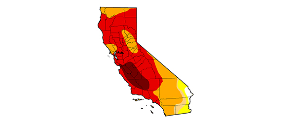
Infographic: California Drought In Motion — 10 Dry Years Animated GIF (2003-2014)
When layered, weekly images of the U.S. Drought Monitor for California show how much worse this drought is than any in the past decade.


