Posts
Infographic: Average U.S. Household Water Use and Bills, 2015-16
1 Comment
/
High prices do not necessarily mean high bills.
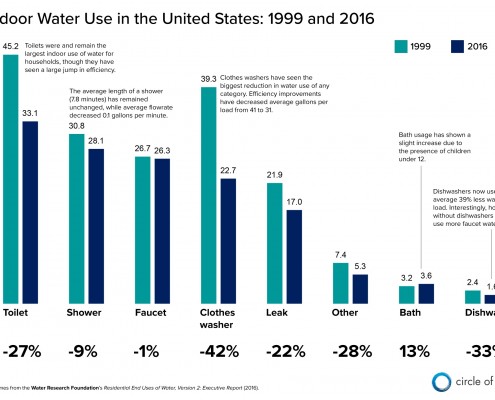
Infographic: Indoor Water Use in the United States, 1999 and 2016
Better technology is helping U.S. households conserve water.
It…
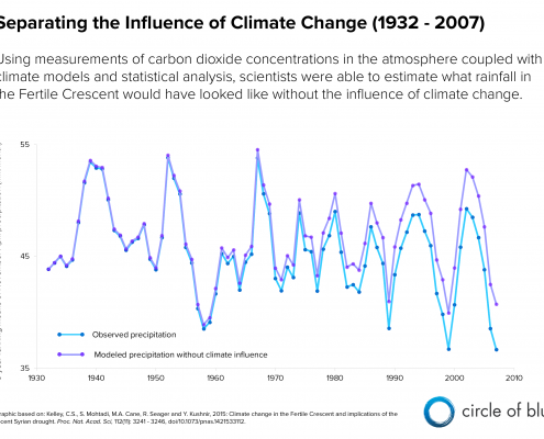
Infographic: Syria Drought and Climate Change
Winter rainfall in the Fertile Crescent has declined 13 percent…
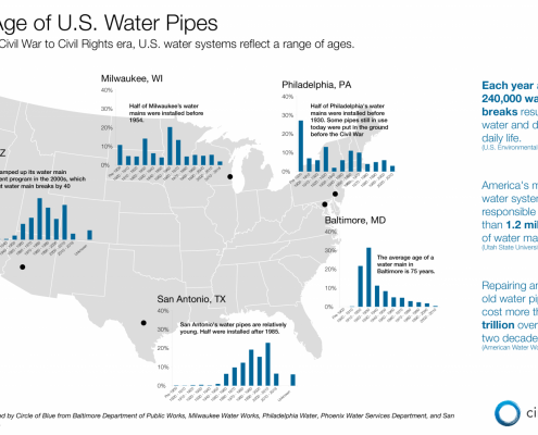
Infographic: The Age of U.S. Drinking Water Pipes — From Civil War Era to Today
Water main ages reflect the nation’s growth
By Brett Walton
Circle…
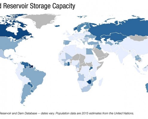
Infographic: Global Reservoir Storage Capacity
The rate of storage expansion has slowed since the mid-20th century
Hoover…
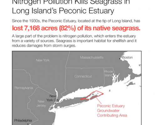
Infographic: Nitrogen Pollution Is Killing Long Island Ecosystems
Seagrass, shellfish, wetlands, and fish are dying in the Peconic…
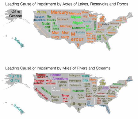
Infographic: U.S. Surface Water Pollution by State
More than half of the country's lakes and rivers are not meeting water quality standards.
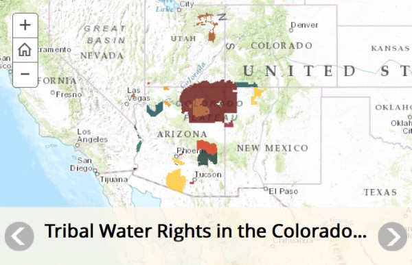
Interactive Map: Indian Water Rights in the Colorado River Basin
Native American tribes are emerging leaders in the drying basin.

Infographic: NASA Satellites Reveal Global Groundwater Depletion
The world's largest aquifers are under stress, according to a decade of data from the GRACE satellites.
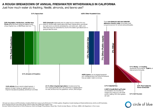
Infographic: California Freshwater Withdrawals
A breakdown of where California's water is used most, from fracking and Nestle's bottling plant to almonds and lawns.
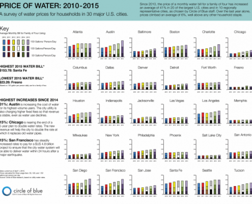
Infographic: Price of Water in 30 Major U.S. Cities (2010-2015)
Cities raise rates to pay for repairs and to respond to conservation.
The…
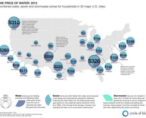
Infographic: 2015 Price of U.S. Water, Sewer, and Stormwater
Map of the cost of water service in 30 major U.S. cities.
The…

