Posts
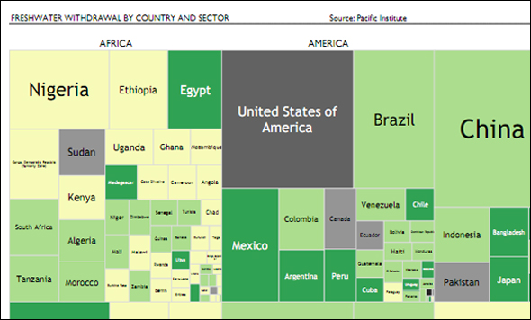
Infographic: Tree Map of Freshwater Withdrawal by Country — A Comparison Between Continents
1 Comment
/
Does the population of a country affects to its freshwater withdrawal? and its geographic location? Are there differences between Continents? and within them? How the availability of freshwater is spread around the economic sectors?
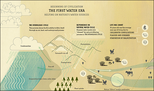
Infographic: Three Eras of Water — The History of the Relationship Between Civilization and Nature
The infographic portrays the evolution of water technology, including its immediate successes of human progress and the disadvantages of that progress. Based on an essay by Peter Gleick, the scientific, social, and historical findings are translated into this piece, putting those patterns in a contemporary light.
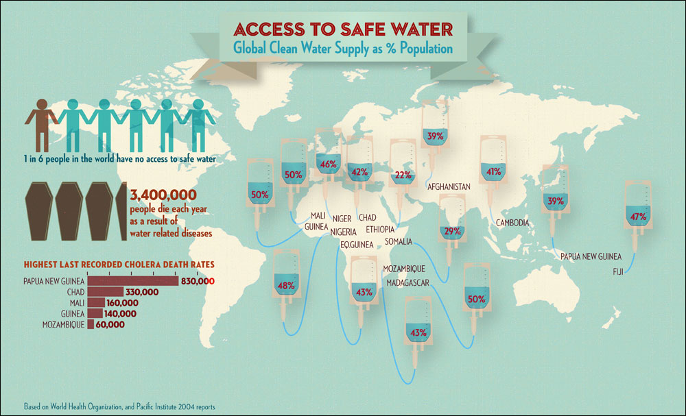
Infographic: Access to Safe Water—Countries Where Less Than 50 Percent Have Access
Global clean water supply by countries those less than 50% of the population can reach, and its facts, based on WHO and Pacific Institute 2004 reports.
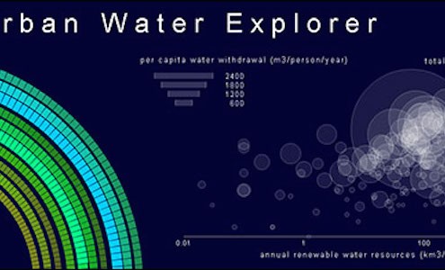
Infographic: Interactive Urban Water Explorer
Entry in the 2011 Urban Water Design Challenge, sponsored by Visualizing.org and Circle of Blue.
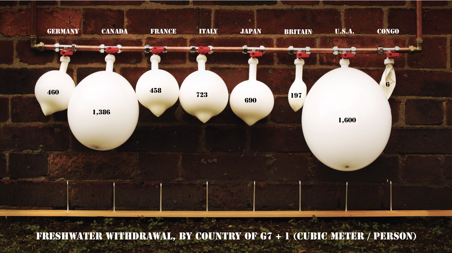
Infographic: Freshwater Withdrawal by G7 Country
This visualization visually and physically describes the freshwater withdrawal per capita from the G7 and another nation.
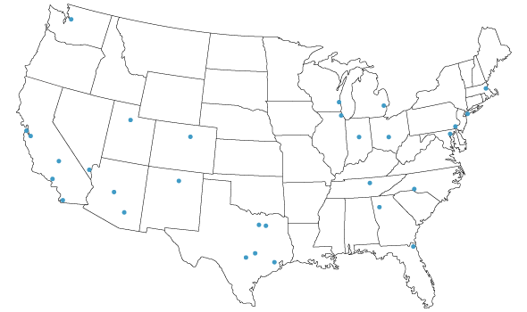
Infographic: Wastewater Treatment Costs in Major U.S. Cities
Following Circle of Blue’s survey of water prices, we examine the wastewater costs of the same 30 major cities.


