
Posts
 https://www.circleofblue.org/wp-content/uploads/2011/05/infographic-freshwater-with.jpg
356
590
Circle of Blue
https://www.circleofblue.org/wp-content/uploads/2018/06/Circle-of-Blue-Water-Speaks-600x139.png
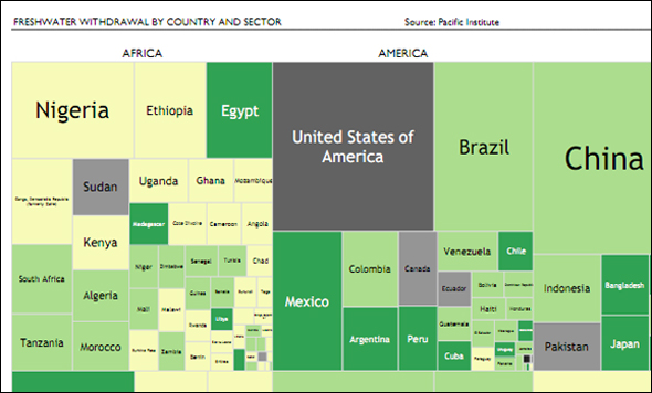
Circle of Blue2011-05-12 08:30:192011-05-12 10:10:04Infographic: Tree Map of Freshwater Withdrawal by Country — A Comparison Between Continents
https://www.circleofblue.org/wp-content/uploads/2011/05/infographic-freshwater-with.jpg
356
590
Circle of Blue
https://www.circleofblue.org/wp-content/uploads/2018/06/Circle-of-Blue-Water-Speaks-600x139.png
Circle of Blue2011-05-12 08:30:192011-05-12 10:10:04Infographic: Tree Map of Freshwater Withdrawal by Country — A Comparison Between Continents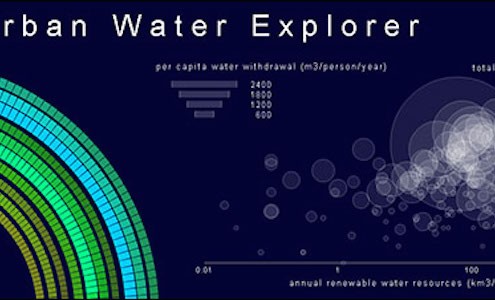 https://www.circleofblue.org/wp-content/uploads/2011/04/urban-water-1.jpg
300
783
Circle of Blue
https://www.circleofblue.org/wp-content/uploads/2018/06/Circle-of-Blue-Water-Speaks-600x139.png
Circle of Blue2011-04-22 09:42:052016-01-05 13:12:06Infographic: Interactive Urban Water Explorer
https://www.circleofblue.org/wp-content/uploads/2011/04/urban-water-1.jpg
300
783
Circle of Blue
https://www.circleofblue.org/wp-content/uploads/2018/06/Circle-of-Blue-Water-Speaks-600x139.png
Circle of Blue2011-04-22 09:42:052016-01-05 13:12:06Infographic: Interactive Urban Water Explorer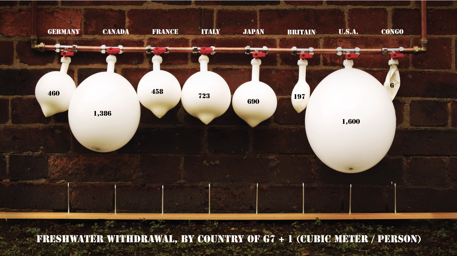 https://www.circleofblue.org/wp-content/uploads/2011/04/freshwater-withdrawals.jpg
819
1459
Circle of Blue
https://www.circleofblue.org/wp-content/uploads/2018/06/Circle-of-Blue-Water-Speaks-600x139.png
Circle of Blue2011-04-17 10:13:192011-04-27 11:42:18Infographic: Freshwater Withdrawal by G7 Country
https://www.circleofblue.org/wp-content/uploads/2011/04/freshwater-withdrawals.jpg
819
1459
Circle of Blue
https://www.circleofblue.org/wp-content/uploads/2018/06/Circle-of-Blue-Water-Speaks-600x139.png
Circle of Blue2011-04-17 10:13:192011-04-27 11:42:18Infographic: Freshwater Withdrawal by G7 Country